"There is nothing worse than a sharp image of a fuzzy concept." — Ansel Adams (1902—1984).
Teaching tool
Black and white photography can be considered many different ways: as something old fashioned only done by retrograde photographers, as something you learn at the school lab and then grow out of, as a way to distinguish yourself, as something artsy... Personally I see it mostly as a great learning tool. One cannot grasp all the concepts involved in color photography or in digital photography without already having a thorough understanding of Black and White photography. And I am reminded of this periodically when I screw up some color images.
In the old days one used to learn photography by taking B&W negatives, processing them yourself and then making enlargements with a projector and batches of stinking chemicals. Having done this is still a good way to understand where the problem comes from when your color prints come back from the lab: underexposed negative ? Poor prints ? Poor lens ? Fingerprints on the lens or on the film ?
A more modern example: in my scanning program there are plenty of 'blue point' or such options which meaning and practical use had always been hazy to me. Recently upon scanning B&W negatives I played with the 'black point' and 'white point' settings until I had a clear understanding. Then I could apply it successfully to color images where it's 3 times more complicated but gives better results than using the default.
As a simplification a color film can be seen as 3 B&W films on top of each others: one sensitive to red, one to green and one to blue. The overlap of the 3 creates the color. Same idea for digital images which are composed or juxtaposition of red, green and blue pixels; each set can be seen as a B&W image. And indeed you can indeed separate them with the [Split Channel][RGB] tool of most graphic programs.
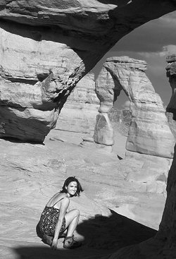
Left: Original color image of Jenny at Delicate Arch, Utah.
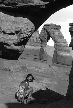
Right: The same picture as seen as a direct Black & White conversion, all channels being equal. Not all that impressive...
Below is the same image with the red green and blue colors separated. This can be done from a color image or directly with a black and white film and a red, green or blue filter in front of the lens. Notice the differences ? How the sky is dark on the red channel and whited out on the blue one ? How the skin becomes white as well on the red channel ? Most photography books tell you to use filters for black and white photography, but which ones ? The red one is too dramatic, the best for still realistic looking images is somewhat between green and red. Personally the two I use are the green-yellow filter and the orange-red filter. They give fairly close results on skins and skies, but the first one gives white vegetation. Just remember that if it's art, there's no truth: manipulate the colors at your will.
Another simple way to understand the use of filters on B&W films: a colored filter will lighten the same color. If you use a green filter, what was green will be white or light grey on the result.
Common possibilities available for black and white photography
Technique
Pro
Con
Traditional B&W film
High quality and durability of fiber-paper prints
Better processed by yourself than in a lab (time consuming) Difficulty in scanning (no ICE)
Chromogenic film
Can be processed in any pro lab Easy to scan
Cannot be printed on standard B&W paper
Color film
Easy to scan into B&W
Cannot be printed on traditional B&W paper Average results
B&W mode on digital camera
Easy
Average results
Color digital image into Photoshop
Possibility to choose or mix the best color channels
Time consuming
Color to black and white transformation: a quick tutorial
Here's a quick tutorial showing the possible steps required to transform a into a black & white picture. This image taken under an overcast sky is not all that interesting in color: low local contrast (but high global contrast), very low saturation. I purposefully shot it underexposed in order to later enhance the clouds, otherwise they'd probably have been burned.
Right: Color to black and white tutorial on an image taken on rappel of the Tête Colombe, above Briançon. Click on the 4 buttons to compare the various steps.
The first possibility is to use the that all graphic programs offer. In Paint Shop Pro, it's hidden under the menu [Image][Greyscale]. All three color channels are averaged. Most programs perform a weighted average of the 3 channels, and the result is usually pretty bland.
By activating the menu [Image][Split Channel][Split to RGB] on the original color image, you create 3 new images containing a different color channel each. Yes, they show as greyscale because they are just intensity maps of red, green and blue, separately. I usually just keep the and here you can see that the contrast is a little bit better than on the standard greyscale conversion.
Finally I apply a custom mix of image enhancement functions in order to get the . Here I duplicate the base layer and perform a [One step Photo Fix] which in this case lightens up the lower part. Then I make another copy of the base layer and perform a [Clarify] for a very dramatic sky. I mix up the layers with a 30 to 50% partial opacity. Finally I apply a noise cleaning filter such as Noise Ninja to the clarified channel as this tends to increase the noise too much.
What's this local or global contrast thing anyway ? Here are 3 examples based on the same image:
(and normal global contrast, also known as clarification)
(and very low local contrast, also known as posterization).
Scripts
For those who just want a quick way to do this, here's a small script for Paint Shop Pro that separates all channels as stacked layers, with an extra desaturated channel on top: 4 different color to B&W conversions at the click of a single button. There's also a variant of this script which, instead of using pure channel separation, simulates the use of glass filters (red, yellow...), also staking them as layer for easy comparison.
Left: View of the layers after application of the GD-BW_Channels2Layer script.
Right: Example of another script included in this download: the ClarifEnhance script applies various image enhancement techniques to 3 different layers. Select from there.
Portraits
Right: High grain for high sensitivity. B&W is still used a lot for portraits for the simple reason that it removes a lot of skin defects: the red nose of the grandfather after too much wine at lunch: gone; the red zits on the hormonal teenager: gone; the blue veins under the skin of the pale blond: gone; even wrinkles are less visible. So if your girlfriend wants some portraits, use some B&W ! And don't choose a film with too low grain: 400iso will do. And a little bit of overexposure will result with a little less details on the skin. High sensitivity film was used on this image to provide more grain for this 'old style look' of Gabriele and his father.
Left: Classic B&W portrait in mixed light conditions. Here Arnaud tasting the output of his still in Antarctica. The other thing about this image is that in B&W it's easier to mix various light conditions: here the flash (blue-white), the neon (green), the halogen (yellow-orange) and the light of the sun coming through the window (yellow-white). In color it's impossible to know beforehand how it's going to turn out. I took more portraits of the team.
Left: Other end of the scale, low ISO film sensitivity for sharp details on this portrait from Cho-Oyu.
High Sensitivity
Left: Aurora Australis on Kodak TMAX 3200 high sensitivity film.
High sensitivity films have less grain in B&W and you can do additional manipulations such as 'pushing' the film by developing it more to increase its apparent sensitivity. Those two images were taken more than 10 years ago on the Kodak TMAX 3200 pushed to an impressive 6400iso. This film is still on the market and has no equivalent in color and no competitors in B&W. Slide films are less than mediocre above 400iso while negatives don't go above 1600iso and cannot be pushed easily (only a few pro labs know how to process pushed negatives).
Here the images have been recolorized (either chemically for an old-fashioned print or with a graphic program) to make them look more like real Antarctic auroras. The grain is acceptable, even allowing me to make A2-sized prints !
Difficult light conditions
Left: Sometimes it's just easier to use B&W, particularly if you cannot tame the light easily. Image taken in strong backlit conditions, with the sun giving lots of flare on a zoom lens. In color everything is either washed out or blackened out, but a B&W image can still give enough grays to keep the image readable. Here Angel's Landing in Zion.
Right: Underwater photography results in 'everything blue' syndromes. Either you use special color film that are hard to find, or you take macro-photography with the flash so the distance doesn't have the time to act or you use B&W. Here two emperor penguins in the frigid waters of Antarctica. (Colorized image).
Left: High contrast can be managed more easily in B&W. The shadow part of the image has been enhanced separately from the sunny part. The same thing can be done on color images but you end up with color casts that are difficult to remove. It is a much easier operation to do in B&W and that was indeed done by hand in the old days by literally putting you hand in front of the part you wanted to lighten out under the enlarger. Taken in early morning at the bottom of the Black Canyon of Gunnison.
Right: High contract between dark rock, light overcast sky and the structured ice of the Fang in Vail.
Digital Black and White
You can always convert your color digital images to make a B&W out of them, but somehow it doesn't look the same. Or you can scan a B&W film but it's a far cry from a good quality fiber paper print. There are a few additional difficulties in scanning B&W:
The scanners are not really meant for B&W, they scan in color and convert to B&W and the scanning softwares are seldom very helpful (for instance I would love to see a channel selection for film areas depending on spatial frequencies)
You have to play a lot with the [Black point] and [White point] settings of your scanner to get the proper contrast. In particular the black point which is often 0% in color sometimes needs to be as high as 10% in B&W to obtain enough saturation.
The digital ICE (dust removal) option available on most high-end scanners doesn't work if the film still contains silver, which is the case with all B&W film except for chromogenic films which are based on color technology. Allegedly the new Nikon Coolscan 5000 can do it but I haven't tested it.
A standard B&W file has one 8 bit channel, meaning 256 shades of grey. The difference between a shade and the next one is often very visible. 16 bit per channel should be the standard for scanning and archiving B&W images but unfortunately, if the scanners can do 16 bits, most graphic programs can only manipulate 8 bits. The only kind of file with enough compatibility that can represent 16 bit greyscale images are TIF files.
High definition and low grain
Left: On long distance landscapes the far away sceneries tend to turn to a hazy blue, a problem avoided by B&W. It's just a little fuzzy and doesn't matter in this case since there's a foreground to focus on. Jenny on the 3rd day of our ascent of the Salathé Wall, nearly one kilometer up El Capitan.
Left: Using the red-orange filter the normally red rock appears as white while the sky turns a dramatic shade of black. This is a view of Fine Jade on the Rectory, Utah.
Left: Similar results with the Priest, on the other side of the Rectory. Low grain and lots of details on this wide angle landscape (21mm).
Here's an extension of the previous tip that produces pictures somewhat like what made Ansel Adams famous. He was doing it by putting silver dust on his paper enlarger, but here's a similar digital trick: take a normal color image and then transform it with Paint Shop Pro by applying the following filters:
[Image][Split Channel][Split to RGB] and keep only the red channel (or better, start from a black and white picture taken through a red filter);
apply [Adjust][Brightness and Contrast][Clarify] twice at a setting of 4;
run the [Adjust][Brightness and Contrast][Histogram Adjustment] with both Low and High clip limits to no more than 0.01% and the Gamma so that shadow details are just visible (something like 1.20);
convert to [Image][Increase Color Depth][16 Million Colors];
[Adjust][Hue and Saturation][Colorize] with Hue at 160 and Saturation at 15 to 20;
[Effects][Sharpen][Unsharp Mask];
and finally back to [Image][Greyscale]. Save as TIFF. Better start with a high resolution shot.;
Right: Everything is in shades of gray on this image with little contrast. Only the crawny trees and the person offer a little contrast on this landscape of Bryce Canyon. If the print is too light, the sky would end up washed out white, if it's too dark the ground would disappear in darkness...
Above: A combination of difficulties well solved on this image of taken while skiing down Mt Pelvoux: cloudy skies giving poor light in color but not in B&W, far hazy background, high contrast snow vs rock, textures (snow), very high definition required to keep the central figure visible (the full image has no less than 30 million pixels). I took 5 color images with a digital camera, assembled them into a panorama, extracted mainly the red channel, applied various contrast enhancements and got this result which looks great when printed on a 1.2m roll paper.
![[DelicateArchColor.jpg]
Original color image of Jenny at Delicate Arch, Utah.](BW/DelicateArchColor.jpg)
![[DelicateArchBW.jpg]
The same picture as seen as a direct Black & White conversion, all channels being equal. Not all that impressive...](BW/DelicateArchBW.jpg)

![[20060902-150421-RappelMeije-Color.jpg]
Color to black and white tutorial on an image taken on rappel of the Tête Colombe, above Briançon. Click on the 4 buttons to compare the various steps.](BW/20060902-150421-RappelMeije-Color.jpg)
![[ContrastNormal.jpg]
Example of global or local contrast changes.](Combine/ContrastNormal.jpg)
![[PSP-Script-BWmultiLayer.png]
View of the layers after application of the GD-BW_Channels2Layer script.](BW/PSP-Script-BWmultiLayer.png)
 Paint Shop Pro that separates all channels as stacked layers, with an extra desaturated channel on top: 4 different color to B&W conversions at the click of a single button. There's also a variant of this script which, instead of using pure channel separation, simulates the use of glass filters (red, yellow...), also staking them as layer for easy comparison.
![[PSP-Script-ClarifEnhance.png]
Example of another script included in this download: the ClarifEnhance script applies various image enhancement techniques to 3 different layers. Select from there.](BW/PSP-Script-ClarifEnhance.png)
![[GabrieleBW23.jpg]
High grain for high sensitivity. B&W is still used a lot for portraits for the simple reason that it removes a lot of skin defects: the red nose of the grandfather after too much wine at lunch: gone; the red zits on the hormonal teenager: gone; the blue veins under the skin of the pale blond: gone; even wrinkles are less visible. So if your girlfriend wants some portraits, use some B&W ! And don't choose a film with too low grain: 400iso will do. And a little bit of overexposure will result with a little less details on the skin. High sensitivity film was used on this image to provide more grain for this 'old style look' of Gabriele and his father.](../Family/GabrieleBW/GabrieleBW23.jpg)
![[Arnaud_Dessommes.jpg]
Classic B&W portrait in mixed light conditions. Here Arnaud tasting the output of his still in Antarctica. The other thing about this image is that in B&W it's easier to mix various light conditions: here the flash (blue-white), the neon (green), the halogen (yellow-orange) and the light of the sun coming through the window (yellow-white). In color it's impossible to know beforehand how it's going to turn out. I took more portraits of the team.](../Antarctica/Portraits/Arnaud_Dessommes.jpg)
![[Giorgio_Tonino.jpg]
Other end of the scale, low ISO film sensitivity for sharp details on this portrait from Cho-Oyu.](../Climbing/ChoOyu/BW/Giorgio_Tonino.jpg)
![[Aurora.jpg]
Aurora Australis on Kodak TMAX 3200 high sensitivity film.](../Antarctica/Sky/Aurora.jpg)
![[AuroraVert.jpg]
Aurora Australis on TMAX 3200](../Antarctica/Sky/AuroraVert.jpg)

![[BW_AngelLandingBacklit.jpg]
Sometimes it's just easier to use B&W, particularly if you cannot tame the light easily. Image taken in strong backlit conditions, with the sun giving lots of flare on a zoom lens. In color everything is either washed out or blackened out, but a B&W image can still give enough grays to keep the image readable. Here Angel's Landing in Zion.](../Climbing/Zion/BW_AngelLandingBacklit.jpg)
![[WaterPenguins.jpg]
Underwater photography results in 'everything blue' syndromes. Either you use special color film that are hard to find, or you take macro-photography with the flash so the distance doesn't have the time to act or you use B&W. Here two emperor penguins in the frigid waters of Antarctica. (Colorized image).](../Photo/640/WaterPenguins.jpg)
![[Base_VPano.jpg]
High contrast can be managed more easily in B&W. The shadow part of the image has been enhanced separately from the sunny part. The same thing can be done on color images but you end up with color casts that are difficult to remove. It is a much easier operation to do in B&W and that was indeed done by hand in the old days by literally putting you hand in front of the part you wanted to lighten out under the enlarger. Taken in early morning at the bottom of the Black Canyon of Gunnison.](../Climbing/BlackCanyon/Base_VPano.jpg)
![[FangBW_VPano.jpg]
High contract between dark rock, light overcast sky and the structured ice of the Fang in Vail.](../Climbing/Colorado/FangBW_VPano.jpg)
![[BW_WaltBailey2.jpg]
Vertical panorama of Max and Jenny climbing at Devil's Tower, Wyoming.](../Climbing/Wyoming/BW_WaltBailey2.jpg)
![[Salathe_BW15_LongLedgeLookAway.jpg]
On long distance landscapes the far away sceneries tend to turn to a hazy blue, a problem avoided by B&W. It's just a little fuzzy and doesn't matter in this case since there's a foreground to focus on. Jenny on the 3rd day of our ascent of the Salathé Wall, nearly one kilometer up El Capitan.](../Climbing/Salathe/Salathe_BW15_LongLedgeLookAway.jpg)
![[BW_FineJade.jpg]
Using the red-orange filter the normally red rock appears as white while the sky turns a dramatic shade of black. This is a view of Fine Jade on the Rectory, Utah.](../Climbing/Utah/BW_FineJade.jpg)
![[BW_Priest.jpg]
Similar results with the Priest, on the other side of the Rectory. Low grain and lots of details on this wide angle landscape (21mm).](../Photo/640/BW_Priest.jpg)
![[BW_TreeHorizon.jpg]
Everything is in shades of gray on this image with little contrast. Only the crawny trees and the person offer a little contrast on this landscape of Bryce Canyon. If the print is too light, the sky would end up washed out white, if it's too dark the ground would disappear in darkness...](../Photo/640/BW_TreeHorizon.jpg)
![[20060505_ViolettesSeracsPano_BW.jpg]
A combination of difficulties well solved on this image of taken while skiing down Mt Pelvoux: cloudy skies giving poor light in color but not in B&W, far hazy background, high contrast snow vs rock, textures (snow), very high definition required to keep the central figure visible (the full image has no less than 30 million pixels). I took 5 color images with a digital camera, assembled them into a panorama, extracted mainly the red channel, applied various contrast enhancements and got this result which looks great when printed on a 1.2m roll paper.](../Climbing/Briancon/20060505_ViolettesSeracsPano_BW.jpg)
